Published on December 15, 2025
The QA Dashboard You Actually Want to Look At

Most dashboards are clunky, confusing, and overwhelming. They’re full of charts, tables, and numbers, but when you actually need answers, like, are we ready to release? Or what should we fix first? - They leave you with noise instead of clarity.
For growing businesses without massive QA teams, that’s a real problem. You don’t have time to dig through endless reports or chase down false alarms. You need something sharper: a view that cuts straight to the essentials and helps you act fast.
That’s why we built the Webo.Ai QA Dashboard. It’s the dashboard you’ll actually want to look at, because it’s designed to answer real questions, not bury you in data.
Why Dashboards Matter More Than Ever
A dashboard is supposed to be the control tower of your QA operations. But most of them just dump raw information without context. They show you numbers, not insights.
The right dashboard should:
- Highlight what matters right now
- Show risks before they become problems
- Keep everyone on the same page
That’s exactly what the Webo.Ai dashboard does.
The Four Quadrants That Redefine QA
Instead of clutter, the dashboard organizes everything into four simple quadrants. Each one answers a key question about your product’s health- so you don’t waste time piecing together the big picture.
Think of it as a preview of your software’s health: a quick snapshot that keeps you oriented. And when you want to dig deeper, just click on any quadrant to open a detailed report. Those reports break down the trends, root causes, and action items behind the numbers- so you always know what’s really happening and what to do next.
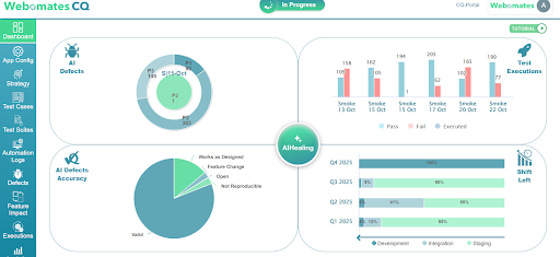
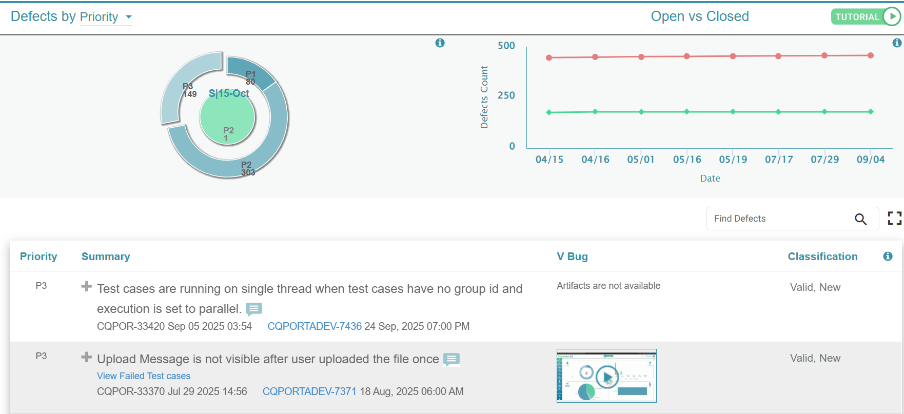
Quadrant 1: AI Defects

This quadrant gives you a bird’s-eye view of your defect landscape. All open defects are broken down by priority: critical (P1), medium (P2), and minor (P3).
It also highlights the new defects uncovered in your most recent test run, so you can quickly spot fresh issues. At a glance, you know:
- How many issues exist
- Which ones are most urgent
- Which just appeared and needs immediate triage
Why the report matters: By drilling in, you see exactly which defects block release, which can wait, and how your defect load is trending over time. That clarity helps you decide what to fix first and whether you’re release-ready.
No scrolling through spreadsheets, just instant visibility into where your attention is needed most.
Quadrant 2: Test Execution
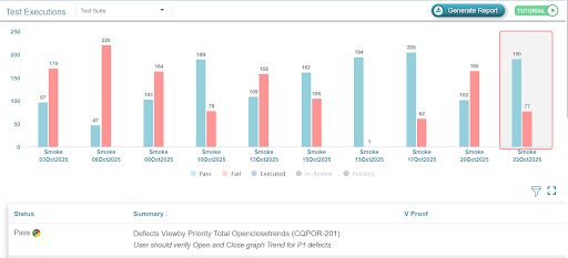
This quadrant shows the pulse of your QA operations. Every test cycle is displayed as a bar divided into passed and failed test cases.
At a glance, you can see:
- Whether stability is improving or slipping
- If failures are clustering in certain runs
- How close you are to release readiness
Why the report matters: The detailed view reveals failure clusters, stability trends, and recurring problem areas. It helps you prioritize engineering focus, spot regressions early, and decide whether the product is stable enough to push forward.
Quadrant 3: AI Defect Accuracy
Not every defect your system flags is a real bug. Some aren’t reproducible, some are intentional feature changes, and some work exactly as designed. Wasting time on these is frustrating.
This quadrant clears the noise by categorizing defects into:
- Valid- real issues that need fixing
- Not Reproducible- uncertain cases that need further review
- Feature Changes- expected updates that caused differences
- Works as Designed- no bugs at all
Why the report matters: The expanded report shows patterns in false positives and wasted effort. That insight helps you streamline triage, cut distractions, and make better calls about where QA time and developer effort should be invested.
Quadrant 4: Shift Left Metrics
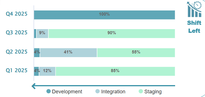
This quadrant looks at when in the development cycle defects are being caught. Defects are mapped to three stages:
- Development- found early during frequent regression runs
- Integration- caught in modular or overnight runs that test multiple features together
- Staging- discovered in full runs before release
Why does this matter?
Because fixing bugs early is dramatically cheaper than fixing them late. This quadrant makes it clear whether your testing strategy is catching issues in time or letting too many slip through.
See It for Yourself
You don’t have to set up your own application or upload anything to experience this dashboard. With our sandbox, you can log in and explore a preloaded application that already has real test data.
The sandbox uses the exact same dashboard we deliver in the CQ portal. That means you get to see the four quadrants in action - defects, test execution, accuracy, and shift-left insights - just as they would appear for your own application.
It’s a no-risk way to try the dashboard. No integration, no setup, no waiting. Just sign in and see how it feels to finally have QA clarity at your fingertips.
The Bottom Line
Most dashboards are overwhelming. The Webo.AI dashboard simplifies. It gives you the visibility you need to release faster, fix smarter, and save time along the way.
See the dashboard in action. When you’re ready, Start a free trial with Webo.AI and experience the four quadrants—defects, test execution, accuracy, and shift-left insights—so your team can release with confidence.
Ready for a QA Dashboard You'll Actually Use?
Get release readiness, defect accuracy, and shift-left insights in one place. Webo.AI gives you the clarity you need to release faster, fix smarter, and save time—no more overwhelming spreadsheets.
Start Free TrialFrequently Asked Questions (FAQs)
1. How is the Webo.ai QA dashboard different from traditional QA dashboards?
Traditional QA dashboards often provide extensive metrics and visualizations. Webo.ai takes a different approach by focusing on what those metrics actually mean for decisions around release readiness, risk, and stability.
By organizing insights into four clearly defined quadrants, the dashboard helps teams quickly understand where they stand and what to do next.
2. Who is this dashboard best suited for?
This dashboard is best suited for growing teams that need clear answers without adding more complexity. It helps QA managers, engineering leads, and founders get a clear view of product quality, reducing the need to analyze detailed reports.
3. How does the dashboard reduce time wasted on false positives?
Not every flagged issue deserves the same attention. The AI Defect Accuracy quadrant helps teams quickly identify which defects actually need attention and which ones don’t, such as non-reproducible issues, expected feature changes, or cases where the application is working as intended.
This way, QA and engineering teams can spend their time fixing real problems instead of chasing false positives.
4. What insights does the Test Execution quadrant provide beyond pass/fail numbers?
Instead of just showing pass or fail numbers, this quadrant helps teams see how stable the product is over time. It highlights patterns in failures and makes it easier to catch regressions early, so you can see whether quality is improving or declining.